
Playing Card Design
The playing card calls for artistic treatment and although the constrained size imposes some limitations there is an almost bewildering wealth and variety of designs in playing cards and their tuck boxes. The serious player requires design to be unobtrusive so that aesthetic considerations remain in the background. However, with modern manufacturing technology more eye-catching designs are becoming popular as gifts, collectibles and for their attractive appearance.
“It might be supposed that in the playing card industry, as with textiles, there are teams of experts continually engaged in producing new designs, bringing out novelties and generally occupied in keeping the product up-to-date with fashions...” from a paper delivered by Dr Richard Brandes, export manager of Ferd. Piatnik & Sohne, Vienna, delivered at the International Playing Card Conference, London, October 1957.
Tradition
THE DESIGN OF PLAYING CARDS involves a balance between utilitarian constraints and artistic possibilities. The basic purpose of playing cards hasn't changed much in the last 640 years, but the fundamental precepts and principles of design and print have been continuously developing and improving to the present day.
Tradition - or conservatism - bears quite heavily on the design of standard cards, especially the court cards, and until recently the designs were of little significance in the sale of playing cards because the serious card player is mainly interested in the quality and durability of the cards, not in their novel design. He or she always wants the cards she is used to. For this reason card faces remained unchanged for centuries.
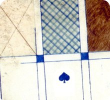
Above: artwork for updated version of early Danish playing card, c.1845 more →
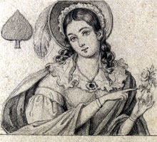
Above: hand-drawing of Transformation cards was a popular pastime 150 years ago more →
During the 19th century, as new technologies were developed, playing card manufacturers began to modernize the designs, attempting to rationalize some of the idiosyncrasies which had crept into playing card designs. These designs were subsequently adopted into double-ended versions. In 1832, after an attempt to introduce new ‘modernized’ designs, De la Rue imitated the earlier wood-block style in the new technology of letterpress. These designs were subsequently redrawn with more decoration and became the basis for all their double-ended courts.
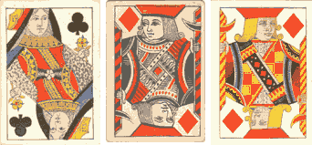
Above: Some modernized court designs, 1820-1834. a) Hunt, c1820 b) De la Rue, c1832 c) De la Rue, c.1834
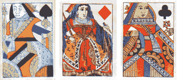
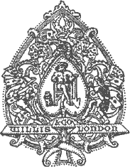
Above: Court designs, 1860-1875. a) Reynolds, c1860 b) Goodall, c1865 c) Willis c.1870
In 1840 Reynolds also modernized their court card designs with an overlay of decorative scroll-work and patterning on the clothing. Other makers experimented with novelties or variations in the design details, such as headgear, crowns, faces, etc. Charles Goodall, for example, produced ‘modernized’ court card designs, with some unusual features, which did not last long.
In 1860, Goodall produced a completely new design in double-ended format only, and which is still in use today in multiple imitations world-wide. The reduction of Playing Card duty from one shilling to threepence in 1862 led to expansions in playing card sales, and no doubt new players were tempted to enter the market. Manufacturers, in general, began taking pride in the quality and elegance of their designs, so as to attract the best clientèle, and from this time onwards special personalised Aces of Spades were designed, instead of the 'Old Frizzle' duty ace.
The advent of double-ended cards towards the end of the 18th century and early 19th century presented playing card designers with a new challenge. Sometimes the two ends were just mirror images of each other. Some court figures were more thoughtfully designed with clever solutions in achieving the double ended result. Around this period card players began to want indices and often these are found pencilled in the corners of packs dated around 1870 onwards.


Above: Ace of Spades designs, 1862 onwards
a) Charles Goodall, c1864-68 b) James English, c1867 c) Willis and Co., c1869.
Case Study
Above: in 1980 Egbert Moehsnang designed a contemporary Swiss-suited pack based on traditional XV century cards more →
Playing Card Backs
The earliest playing cards had blank backs because of the difficulty of precisely aligning a back pattern with the fronts of the cards during manufacture, without small differences which would permit an opponent to recognise cards from their backs. Of course there was already the problem of the backs being marked with smudges or spots. During the eighteenth and nineteenth centuries, as printing technology improved, simple patterns of dots, geometric shapes, sprigs or other small repeating motifs were introduced and gradually perfected on the backs of cards. So until that time, as card was valuable, incomplete packs would not be thrown away. Instead the plain backs were often re-used as notelets, invitations, calling cards, library cards, and so on more →
Playing card decoration reflects the fashion of the day, and is likely to be guided by prevailing tastes and styles. However, the serious card player required back designs which would be as unobtrusive as possible, and aesthetic considerations remained entirely in the background. To some extent, plain and formal back designs have become something of a tradition. But possibly to stimulate more sales, in the 1875-76 season Woolley & Co. brought out a series of Japanese designs which were announced as follows: "The quaint figures and effective colouring of the Japanese workmen have been adapted… to the ornamentation of the backs of playing cards, producing most effective designs." [The Stationer and Fancy Trades' Register, August 5, 1875]. Owen Jones, the architect and designer who designed card backs for De la Rue, realised that many of the great masterpieces from antiquity were based on geometrical grid patterns embellished with graceful and refined arabesques, and so Victorian playing card manufacturers began to produce more attractive back designs.

Above: assorted nineteenth century back designs by Thomas de la Rue & Co., Ltd.
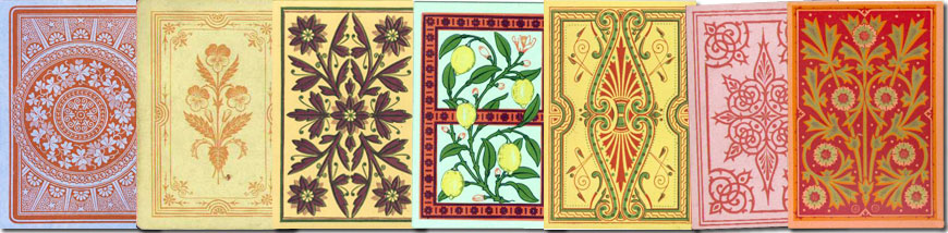
Above: ornamental back designs by W.H. Willis & Co. (London) 1870s-80s. more →
Our economic life has undergone far-reaching changes, more and more goods are bought and fashion has an important effect on the sale of goods. At the same time, the 19th century saw the beginning of a period of innovation and trial and error for printers and industrial designers which has continued right up to today: changing technologies open new possibilities. Many beautiful designs began to emerge from house artists such as Owen Jones (De la Rue), Harrison Weir (Willis & Co.), Aymer Vallance (James English & Co./Peerless Card Company) and George Cruikshank, Richard Doyle and George Clulow (Charles Goodall). Moving into the 20th century, the artist William Barribal was contracted to work for Waddington's. Other playing card designers and artists include F. C. Tilney, Jean Picart Le Doux, Lucy Dawson, Harry Rountree, Paul Brown, G.D. Armour, Siriol Clarry, Sonia Delaunay, Rihards Zarinš, Stefans Bercs, Reinholds Kasparsons, Alfreds Scwedrevitz, Karlis Padegs, Gertrude Kümpel, Melchior Annen, Carmen G Carballeira and Anabella Corsi. See also: The 52 Club Catalogue 1984 • Art in Playing Cards →.
Sales of playing cards have risen since the buying public have more disposable income, more leisure time and a varied selection of colourful picture backs to choose from. Cards are now bought simply because of their attractive appearance and packaging. Pictorial back designs are especially popular with customers in department stores and those who buy from catalogues or websites, because they catch the eye and appeal to the imagination. In addition, the tourist demand for souvenirs became more important...
Above: playing cards designed by Siriol Clarry for John Waddington Ltd, c.1960, based around the theme of the Four Elements. more →
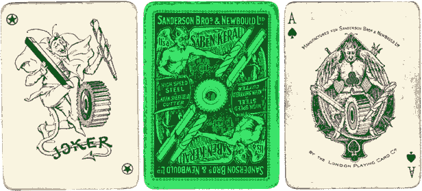
Left: Special Joker, Ace of Spades and back design by Chas Goodall and Son, for Sanderson Bros & Newbould Ltd. Sheffield, c.1912.
The Ace of Spades and Jokers are not the only cards to receive the attention of the playing card designer. However, one card player's appraisal of the result might take into account functionality, whilst another may value other features in the pack which the former ignores.
Special Packs
Among the playing cards which are produced mainly for special occasions, the commemorative series occupy a particular place. Serious card players are not the primary audience for these packs. In the case of special packs, the subject itself will suggest style and treatment, but the interpretation reflects designers' preferences, clients' ideas, illustrators' capabilities, financial and policy pressures, social fashions, etc. A compromise between all these has to be made. Today, the primary constraint will most likely be cost which will have a bearing upon questions such as the number of colours, extra artwork or special customisation.
Whatever the reason for the new pack, be it an event, a royal wedding, a centenary, a general election or just a new season, it would be reasonable to seek a solution which identifies the subject immediately, which is not symbolically obscure, and which does not lead to doubt. The final choice must lend itself to good visual treatment - not just a series of photographs pasted into a square frame with pip marks in the corners. Such editions often attract a good deal of attention and sales are maintained, although possibly on a limited scale.
Whilst there may be a trend to publish packs perceived as likely to capture a popular market, comprised supposedly of collectors, so that similar thematic material to phonecards or collector cards is found (e.g. cinema personalities, historical figures, pop stars, vintage cars, birds, flowers, etc.), new packs are also being produced exhibiting more thoughtful design, typographical refinement and special finishes. However, certain of these are little more than "photographs pasted onto a rectangle with pips." To go beyond this formula, more imagination is required!
Typography
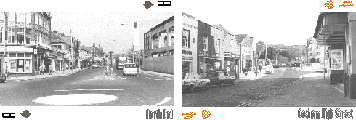
Portsmouth Souvenir Playing Cards, Copyright © (1998), Simon Wintle |
The "Portsmouth Souvenir playing cards" illustrated left are a simple study in typography on playing cards. An elongated typeface has been chosen for the indices whilst the caption is also in a matching typeface. Thus the typography complements the plain black and white photographs to make up a simple souvenir playing card design which is integrated. Further typographic refinements and pictorial motifs can be added to build up the overall 'feel' of the pack, on the backs as well as the box, so that the result looks consistent and natural, as though there had never been a problem! What is left out is just as important as what is included. |
Bearing in mind the requirements of the job, a playing card typeface must have a good regular weight - not too thin, preferably vertical, very legible, probably serifed, and narrow so as to fit economically into the margin. The top typeface (left) is the Goodall Indexes found from c1910 onwards. The second set is in a modern typeface, as used on the above "Portsmouth Souvenir" example. The third example is the typeface used by Games & Print Services Ltd for their early packs (1997), which has now been superceded by the fourth set, which works much better, especially in Jumbo-size. The lowest sample is the typeface used by Richard Edward Ltd. |
|
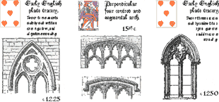
Gothic Architecture Playing Cards, copyright © (1998), Simon Wintle. |
The "Gothic Architecture cards" illustrated left are designed to assist in identifying the date and period of construction of the parts of a typical English parish church. The typeface is a Gothic font, which goes with the traceried windows and mouldings. The idea is that the pack would be available to visitors to old churches and heritage sites as an aid to identification whilst they peruse the building. |
Conclusion
In general the sale of playing cards is much less affected by the variety of designs available than the sale of other comparable items. But there is a demand for innovation and originality in design. New digital technology makes it easier to custom-design playing cards, and people can create their own designs on the desktop and print out proof sheets after each alteration (a robust desktop publishing program and photo editing software, as well as a scanner and high resolution colour printer, are the required equipment. Learn more →) However, with so many options available at the press of a few keys, it takes care to produce something worthwhile. At the same time, the exercise enhances one's critical observation and evaluation of other people's work.
If your pack is going to be manufactured commercially, then the artwork will need to be made ready to deliver to the printer as computer files, in the correct format to be loaded into their machines. The printer will supply technical specifications, or else perform the necessary digital repro at extra cost.
Most playing card manufacturers already have in-house designers "capable of producing high quality original designs whilst maintaining the integrity of the playing cards. Any aspect of the cards' make-up can be designed and tailored to your specific requirements… size, shape, material, graphics, colours and finishes, pips, courts, backs… even security inks (for ultra violet light)." On the other hand, why not try to do it yourself! See our page about production methods for small-scale editions.


By Simon Wintle
Member since February 01, 1996
Founder and editor of the World of Playing Cards since 1996. He is a former committee member of the IPCS and was graphics editor of The Playing-Card journal for many years. He has lived at various times in Chile, England and Wales and is currently living in Extremadura, Spain. Simon's first limited edition pack of playing cards was a replica of a seventeenth century traditional English pack, which he produced from woodblocks and stencils.
Related Articles

Never Mind the Belote
Limited edition Belote pack with designs by a collective of 24 street artists.

Playing card designs by Franz Exler
Reconstruction of playing cards from the original 1903 designs.

MITSCHKAtzen
Clever cat designs by the Austrian artist and illustrator Willi Mitschka.

22 Pittori in 22 Arcani
Collaborative Tarot with contributions from 22 different Italian artists including Menegazzi and Tav...

Whist by Ditha Moser
Ditha Moser created this minimalist Whist deck in 1905, in the style of the Vienna Secession art mov...

Keith Haring playing cards
Energetic graffiti images by the American artist Keith Haring.

Jockey Club de Buenos Aires
Spanish-suited pack by Chas Goodall & Son Ltd for the Jockey Club, Buenos Aires.

Carte di Natale
Designed by Pier Canosa as a Christmas pack for the Cortina Art Gallery in Milan.

Queen of Arts
A wide variety of women artists celebrated on cards with illustrations by Laura Callaghan.

Fredericks & Mae playing cards
A rainbow pack from the design team of Fredericks & Mae and Benjamin English.

Pam is the Knave of Clubs
Playing cards as metaphors in 18th century art - from fate, chance and social hierarchy t...

Leadmill playing cards
Promotional pack for an arts centre in Sheffield with designs by Martin F. Bedford.

Typographic Playing Cards
Typographic Playing Cards designed by Jim Sutherland, c.2010.

Damn! Fools by Moon
Damn! Fools playing cards designed by Leo Scherfig, 2022.

Crown Hill playing cards
Crown Hill playing cards with illustrations by Corrine Guiney, USA,

Heathen Divinities
Handmade playing cards from the British Museum depicting classical Greek and Roman gods and goddesse...
Most Popular
Our top articles from the past 28 days