
Rider Waite Tarot early editions
Rider Waite Tarot early editions
The Rider Waite Tarot early editions
After the first edition of the Rider-Waite tarot in 1909, four further editions were published until approx 1940. These versions differ in several details: outline artwork, colours, lettering, card thickness, the box and the accompanying book. The letters A,B,C and D were given at random and do not refer to the order of publication of the packs. Below are scans from each of these 4 different versions with some notes to aid identification (the scans faithfully preserve the colours of the cards themselves). See our Comparison Chart.

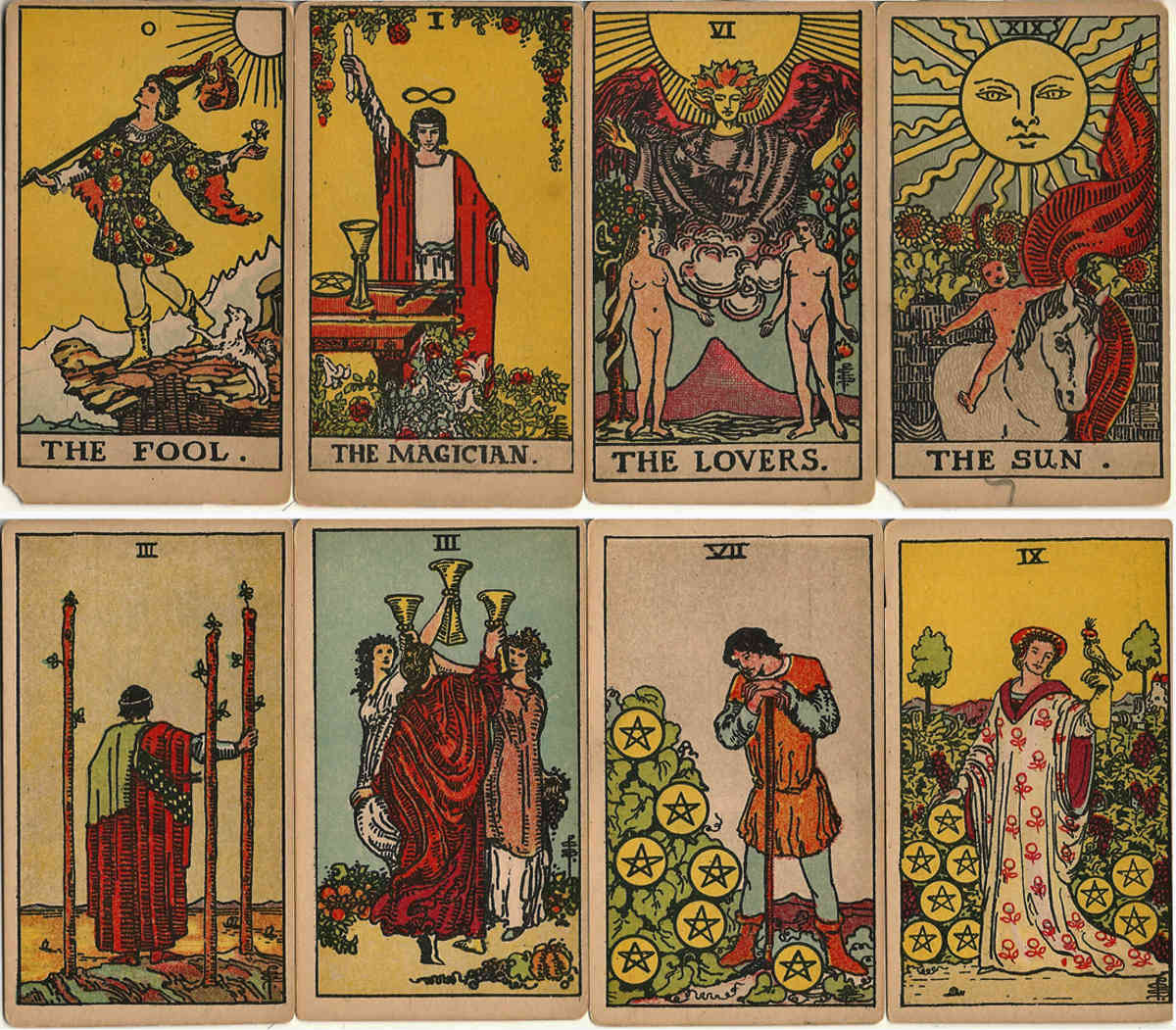
Above: the 'Sun' card from the first five editions of the Rider-Waite tarot serves as an aid to identifying the respective editions. Small tell-tale differences in the line drawings and colours, the lettering and the card thickness, allow these early editions to be classified. For example, in 'The Sun' card, an extra undulating line appears to the right of the Roman numeral at the top, but is missing in Pam-B. Differences in the facial expressions and eyes on the sun face are also discernible, as well as the shading lines in the banner, the printed calligraphy titles, the sunflowers, etc. more →
Version “Pam-A”


Right: ‘brown crackled’ back design from the “Pam-A” edition, 1910-20 →
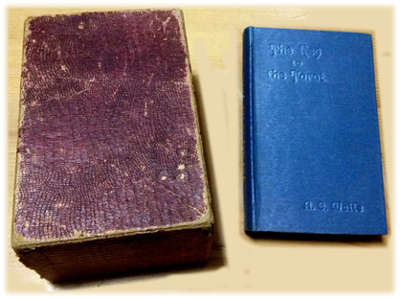
“Pam-A” is the second edition and was issued from April 1910 till about 1920 by William Rider & Son. The back of the cards have a brown crackled design. “Pam-A” has long been considered the oldest of the packs. There are two versions known: the difference between lies in the thickness and weight of the cards. The line art and colouring is the same, save for a few very small details one or two cards (in red). William Rider & Son probably switched to a slightly less thick cardstock in later years. It is also possible they started using a new red plate at this time. The early version has a thickness of approx 38-40mm and a weight of 268 gms. The later version has a thickness of 35mm and weighs 252 gms. “Pam-A” was sold in a maroon two-piece cardboard box, accompanied by the book “Key to the Tarot” by Arthur E. Waite. The date of the book is 1910, publisher William Rider & Son Ltd., London. There is no printer mentioned in the book. The cover of the book is blue. The title is a Ouroboros in gold embossed on the front and also in gold embossed on the spine. Alternatively it was also sold in a dark blue slipcase cardboard box and a Prussian blue cardboard slipcase box, both without the book. There is one pack known of the second version on the thinner cardstock that was sold in 1920 with a different looking book. This book was also blue, but no Ouroboros or gold. The title is embossed on the cover and spine. This book mentions the date of 1920 and the printer to be Butler & Tanner, Frome and London.
Left: detail from 'The Lovers' card. The mechanical method used for tinting the skin colour and the hand-made cross hatching on the mountain make this card helpful to classify the different editions more →
Version “Pam-B”


Above: “Pam-B” is the youngest of the early packs and was published from 1931 till about 1940. The oldest packs are from 1931, published by William Rider & Son. Later packs are not dated and were published by Rider & Co., after the publishing house changed name. The back of the cards is a brown crackled design. The line art of “Pam-B” is distinctly different from “Pam-A” and of that published in the “Pictorial Key to the Tarot”. It has clearly been redone for this edition. The line art of “Pam-B” is similar to that of “Pam-C”, with the exception of The Sun card. “Pam-B” was sold in a maroon two-piece cardboard box (which was significantly smaller than that of “Pam-A”) with the book “The Key to the Tarot” by Arthur E. Waite. The book was blue-grey, with the title in black on the spine. The printer mentioned in the book is Fisher, Knight & Co. Ltd, Gainsborough Press, St. Albans. “Pam-B” was also sold without the book in a dark blue cardboard slipcase box. “Pam-B” packs sometimes come with one or two extra blank cards. Thickness of the pack is 26mm and the weight is 212 grams.
Right: ‘brown crackled’ back design from the “Pam-B” edition, 1931-40 →

Left: detail from 'The Sun' card. The extra wavy line to the right-hand side of the Roman numeral XIX is missing in this edition. Differences in the facial expressions and eyes are also discernible more →
Version “Pam-C”


Above: “Pam-C” was published from approx 1920 till 1928 by William Rider & Son. The back of the cards ia a brown crackled design. The line art of “Pam-C” is distinctly different from “Pam-A” and of that published in the “Pictorial Key to the Tarot”. It has clearly been redone for this edition. The line art of “Pam-B” is similar to that of the “Pam-C”, with the exception of The Sun card. “Pam-C” was sold in a maroon two-piece cardboard box (which is significantly smaller than that of “Pam-A”) with the book “The Key to the Tarot” by Arthur E. Waite. The book sold with “Pam-C” has a green linen cover with the title on the spine. The printer is Chance & Bland Ltd., Gloucester. “Pam-C” was also sold without the book in a dark blue cardboard slipcase box. Most known packs were sold in this slipcase box. The “Pam-C” pack sometimes comes with one extra blank card. Thickness of the pack is 26mm and the weight is 212 grams.

Right: ‘brown crackled’ back design from the “Pam-C” edition, 1920-28 →
Left: detail from 'The Lovers' card. The differences in the angel face features make this card helpful to determine which edition we are looking at more →
Version “Pam-D”


Above: “Pam-D” was issued alongside “Pam-C”, from about 1920 till 1931. It was published by William Rider & Son. The back of the cards have a brown crackled design. The line art is exactly like “Pam-A”. However, the colours on many packs bleed outside the line art due to poor alignment. The colours of the cards often look muddied, possibly due to the combination of lithography and photographic techniques during printing. The “Pam-D” pack is also known to have badly cut corners and the cards are often not homogeneous in size. “Pam-D” has been sold in several different boxes. The very first packs come in a maroon two-piece cardboard box (exactly like that of “Pam-A”), accompanied by the book “Key to the Tarot” by Arthur E. Waite. The date of the book is 1920, publisher William Rider & Son Ltd., London. The cover of the book is blue. The title is embossed on the cover and spine. The printer mentioned in the book is Butler & Tanner, Frome and London. “Pam-D” is also known to have been sold in a maroon cardboard slipcase box and a dark blue cardboard slipcase box. Alternatively, there are packs known to have been sold without a box, with a sticker saying “Made in Great Britain” on one of the cards (6 of Swords). The thickness of the pack is approx. 29-30mm and the weight is 245 grams.
Right: ‘brown crackled’ back design from the “Pam-D” edition, 1920-31 →
Left: detail from 'The Lovers' card more →
In 1971 US Games Systems bought the right to publish the tarot under its current name Rider Waite Tarot from Waite’s daughter, Ms Sybil Waite. The Rider Waite Tarot had a big influence on the tarot world since its creation. In the course of the 20th century many tarots have been based on this pack.
REFERENCES
Jensen, K. Frank: The Early Waite-Smith Tarot Editions, The Playing-Card vol.34 no.1, IPCS, London, July-Sept 2005.
Jensen, K. Frank: The Story of the Waite-Smith Tarot, published by the Association for Tarot Studies.
Images for “Pam-A” and “Pam-D” courtesy Kenji Ishimatsu.

Related Articles

OXO Faces of the Millennium Dinner
Twentieth-century personalities promoting a millennium dinner at the Oxo Tower in London.

Kids Fun Box playing cards
Colourful cards for children with four non-standard suits connected with the natural world.

Tangle Foot Ale
Badger Brewery Tangle Foot strong ale advertising pack.

Tarot Beirut
A beautiful Arabic Tarot : a mystical tool for positive guidance and well-being.

Scientific Whist
“Scientific Whist” : standard cards with instructions for play on the faces by Chas Goodall & Son, 1...

Agent Provocateur
Branded lingerie collection in a pack of pin-up playing cards.

Nimbus playing cards
Mike Steer’s weather-themed pack with suits in four colours and backs for cardistry.

Agatha Christie and Playing Cards revisited
Agatha Christie uses card-play as a primary focus of a story, and as a way of creating plots and mot...

The Decadent Deck
Studies in the eroticism of the female body by Inge Clayton.

Historic Shakespeare
“Historic Shakespeare” playing cards featuring Shakespearean characters by Chas Goodall & Son.

Copechat Paramount Sorting System
Preserving the past: a specimen deck showcasing edge-notched cards and their ingenious sorting syste...

Heartsette by Herbert Fitch & Co, 1893
A glimpse into a busy print and design office in late Victorian London.

Batman® playing cards
Batman playing cards published by InterCol of London 1989.

Can You Believe Your Eyes?
“Can You Believe Your Eyes?” playing cards featuring visual illusions & other oddities.

Pastime Playing Cards for the Blind
The “Pastime” Playing Cards for the Blind manufactured by Goodall & Son Limd., c.1910.

Tarot de las Coscojas
Historical playing card design, tarot symbolism and an almost psychedelic medieval surrealism.
Most Popular
Our top articles from the past 28 days