33: Functional Changes to Playing Cards
The emphasis throughout my collecting has been on the design of the courts cards, and it should be pointed out that there have been some functional changes to cards, which have affected the traditional designs, especially in the 19th century.
The emphasis throughout my collecting has been on the design of the courts cards, and it should be pointed out that there have been some functional changes to cards, which have affected the traditional designs, especially in the 19th century.
DOUBLE-ENDING: said to have been introduced to avoid giving away the presence of court cards in one's hand. It is found in European cards in the 18th century, though such cards made in France at that time had to be exported, as they were not allowed on the home market. The earliest attempt at double-ending known to me in England is one of the versions of Ludlow's Knights Cards by Wheeler (see page 36). This innovation doesn't seem to have found much favour and it was not until the late 1840s that English cardmakers took up the idea again more seriously. It's difficult to know exactly when double-ended cards were introduced; they were certainly on display at the Great Exhibition. There is a reference to at least De La Rue's cards of this type in the Exhibition catalogue. So, as it's unlikely that they were introduced that year on a whim, experiments with the designs were probably undertaken a few years before 1850. The easiest way to produce the desired result is to cut the block or plate in two and use the head end twice. Although this was common practice on the Continent, it was not the method that English makers ended up with. Woolley, possibly Creswick, and even Goodall tried the easy way at first.
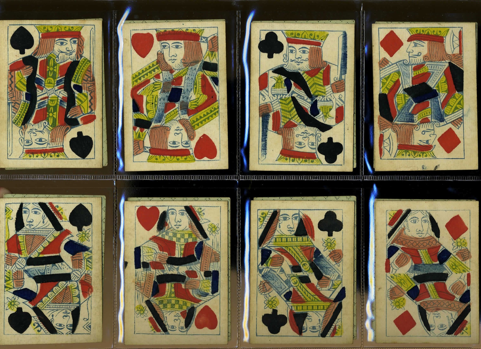
Above: Woolley, c.1850
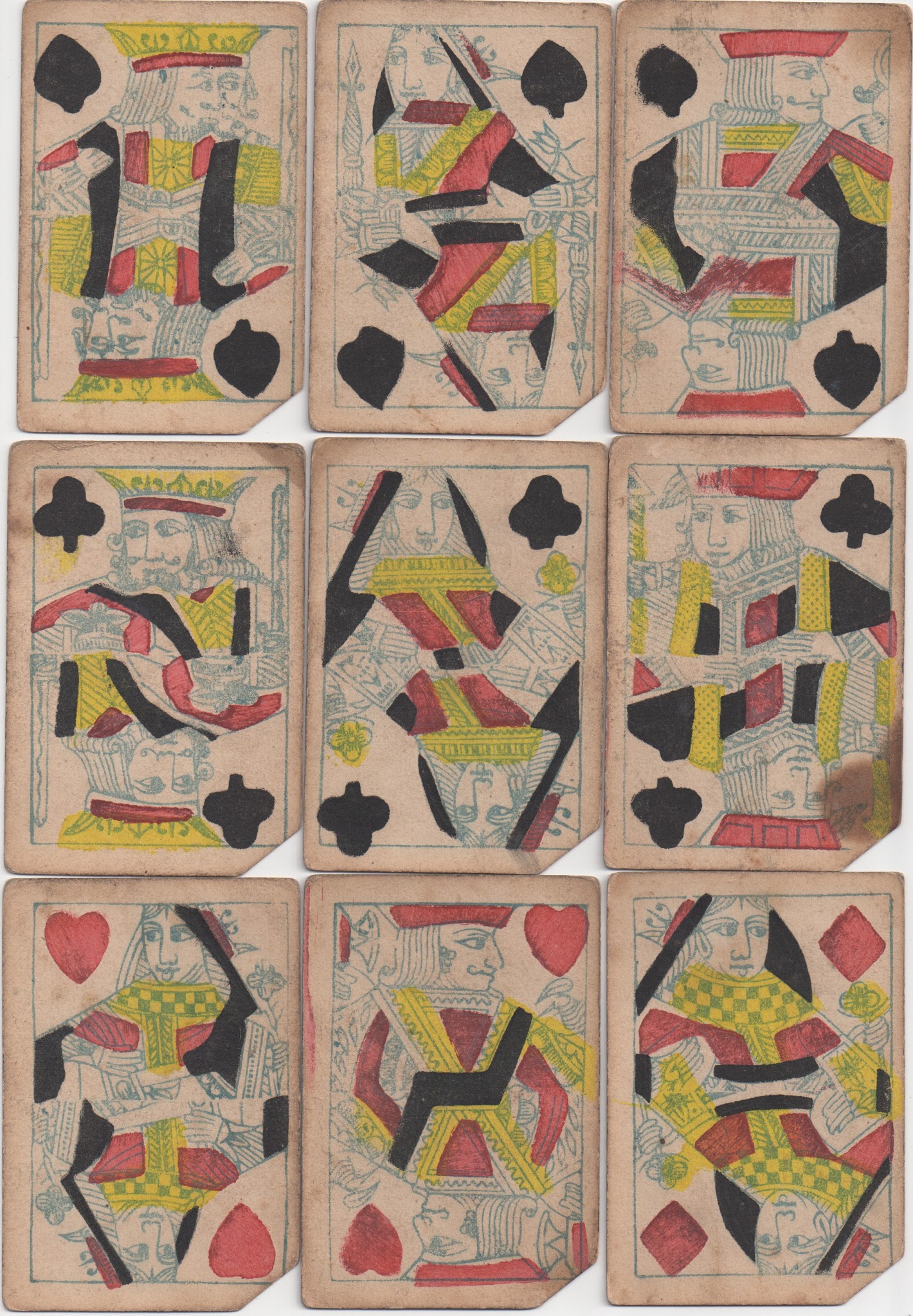
Above: probably Creswick, c.1850
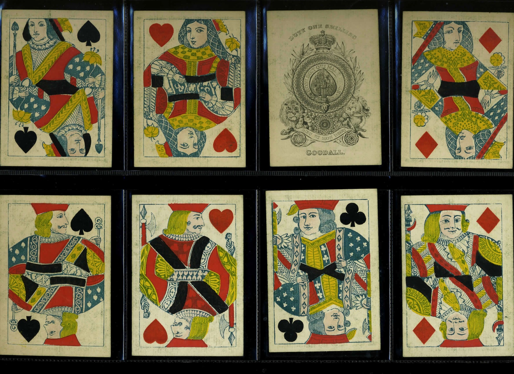
Above: Goodall, c.1850
The horizontal join line that results from this process is clear to see on most of the cards.
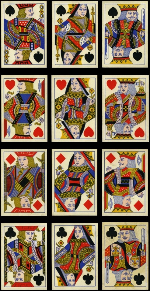
On the other hand, Hardy, Bancks, Reynolds and De La Rue opted for the redrawing of the figures, which involved incorporating the two ends into one overall design. In some cases this has meant that one of the court's hands has disappeared, or a piece of the lower clothing has been moved higher up, such as the back of the QS's skirt shifting to under her arm, as in the Hardy, Reynolds and De La Rue packs (though not illustrated in the last one).
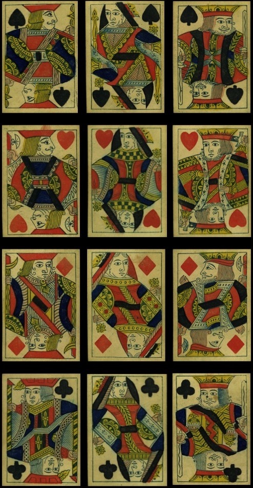
Above: Hardy, c.1850
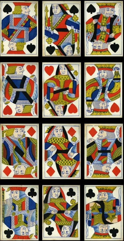
Above: Bancks, c.1850-80
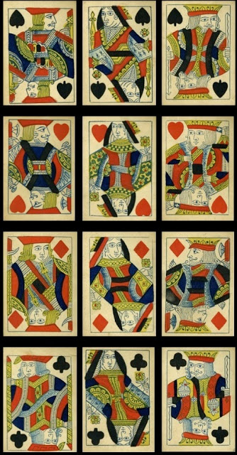
Above: Reynolds, c.1850
Above: De La Rue, c.1855
By the post-Frizzle period none of the new makers who set up production (for example, Willis, James English, Perry) used single-figure courts. All their courts are fully integrated designs, like those of De La Rue and the later Goodall. A few packs with single-figure courts were still in production in England in the post-Frizzle period: I know of examples by De La Rue, Goodall, Reynolds and Bancks. I would guess that by the 1870s their production had ceased, except that Bancks, as the most old-fashioned of the four, may have continued with them longer. In Turnhout, on the other hand, such cards were produced right up until the 20th century.
LEFT-HAND PIPS: the idea behind this is to bring all the pips to the left-hand side of the court cards, so that they can be identified more easily in games that require a lot of cards held at one time, such as whist. It was a requirement of the early 18th century official standardization of the Paris pattern, but it took much longer to get to England. It was the 1870s before most of the makers introduced this change in design. Clearly, there are two ways to deal with putting the pip on the left:
(i) turn the image the other way round;
(ii) alter the traditional design slightly to leave room on the left.
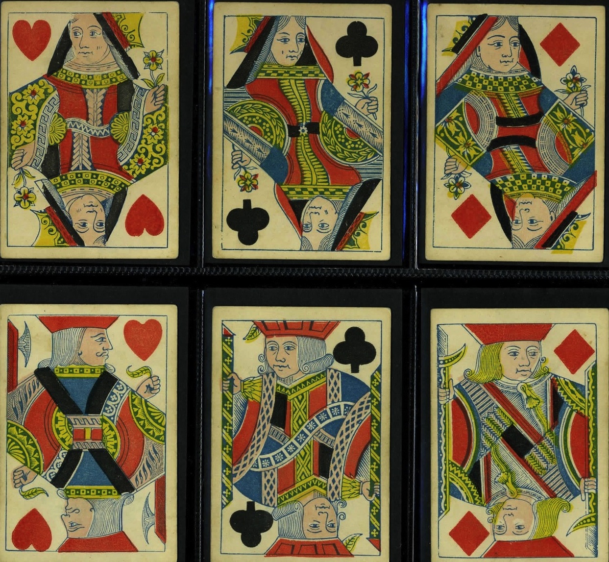
To start with (i) was used by most cardmakers. This meant turning the figures of the six courts with right-hand pips: QS, QC, QD, JH, JC, JD. In most cases it also meant redrawing these courts (or all of them), rather than just reversing the relevant plates (which was probably impossible).
Above: De La Rue D6, c.1875
Just one example will suffice. Most makers had turned versions of their courts, though Reynolds did not. An earlier example is provided by Bancks, who tried turning and redrawing their courts in the Old Frizzle period (see page 31).
The other method, of altering the design to fit the pips in, was employed in one of the courts by the revived Hunt firm and Bancks, though the rest were just turned. In each case the QS has not been turned, but her sceptre has been reduced in size to keep it out of the way of her pip. The clothing and posture of all the queens has been considerably revised.
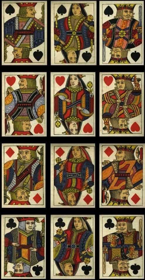
Above: Joseph Hunt H2, c.1875
Strangely, Hunt's later courts are unturned, here with round corners.
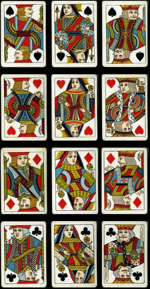
Above: Hunt's Playing Card Manufactory H3, c.1880
Bancks's redrawing is similar to that of the Hunt cards, again with an unturned QS and considerably revised clothing for many of the courts.
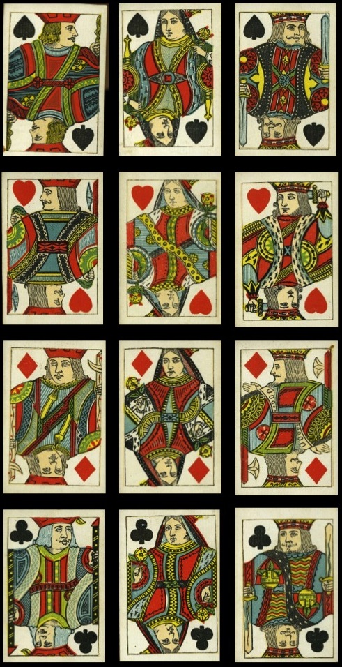
Above: Bancks HB6, c.1880
INDICES: their introduction in the late 1870s actually took away the need to turn the courts in the way we've just described, although it could be argued that the extra pip next to the index is a further guide to identification. Presumably, the idea came to us from America, and it spread very quickly.
The early type of index used by De La Rue, the Dexter, did require the left-hand position of the pip.
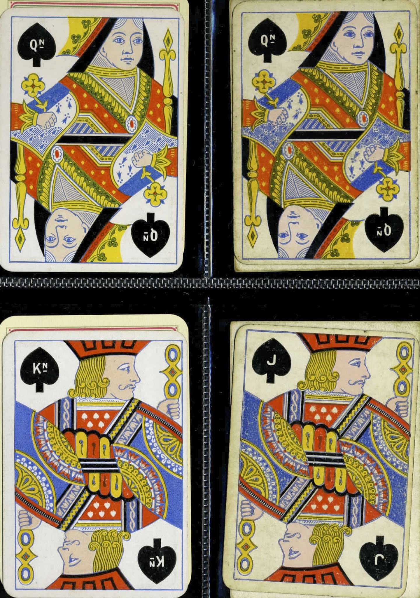
Above: De La Rue, c.1878
On the other hand, the triplicate type of index, used extensively by Dougherty, produced indecision as to where the pip should be or even whether it mattered, if it was cut into. Lee Asher has pointed out that Saladee's patent indices of 1864 were the first example of this type of index.
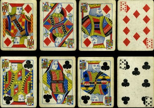
Above: Willis, c.1884, with all the pips on the right and the courts that were usually unturned turned (see the two kings); on the number cards the index is overlaid onto the top left pips.
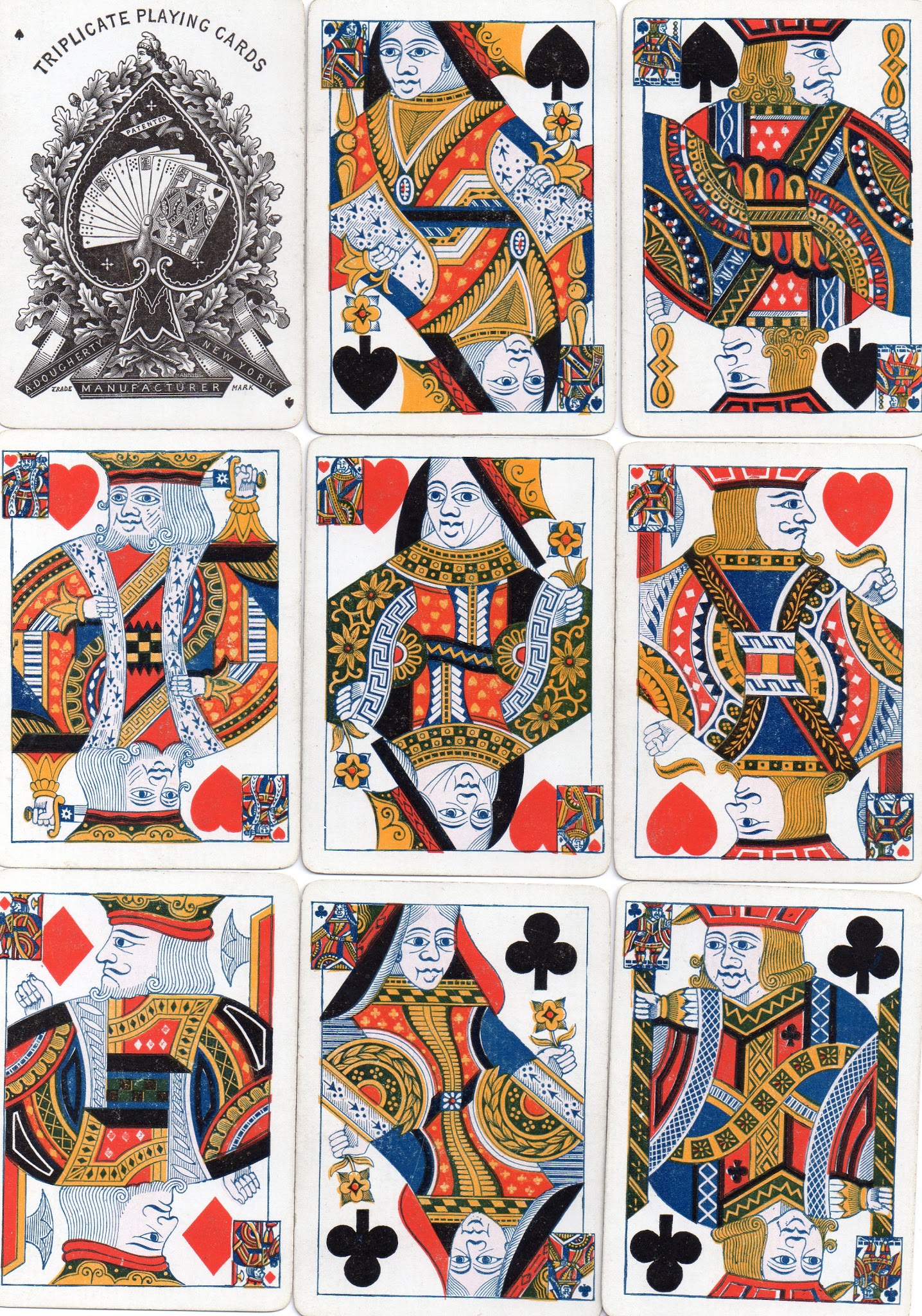
Above: Dougherty, c.1878, with unturned courts and pips or bits of the design cut into.
But the standard type of index that became universal did not require the position of the pip on the left, so there are plenty of examples of unturned courts with indices.

Above: Willis, c.1880
All these innovations changed the traditional look of many of the courts of the standard English pattern. As the size of the index increased, the design of the court cards took up less and less room; witness the large-index packs of today. Below is a sequence of De La Rue JSs from c.1890-1925 showing the changes in index, the size of the figure and two different widths.
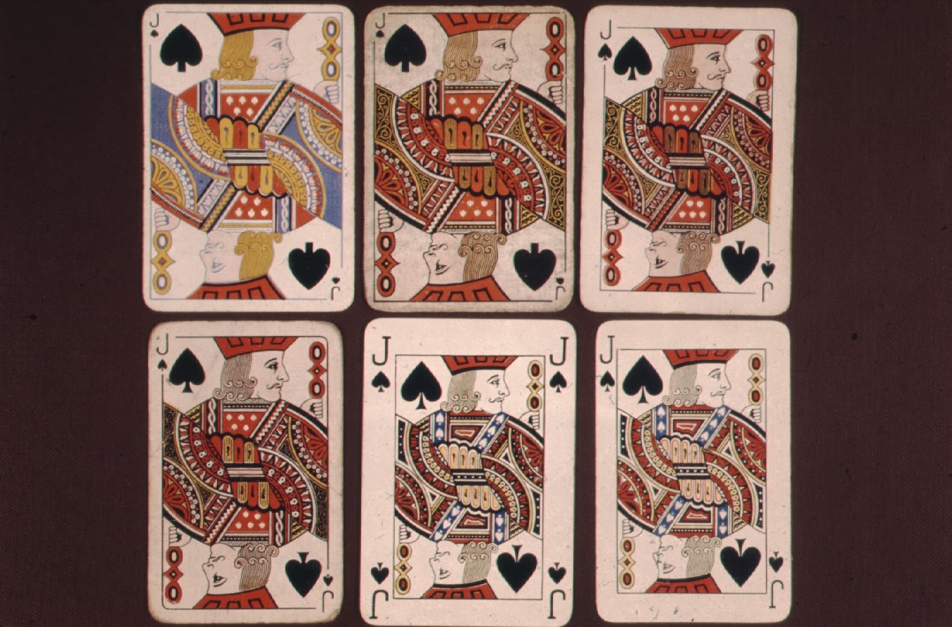
By the time later makers like Waddington and Universal came along, the corner index had taken over the whole function of recognition, so it didn't matter whether the design was true to tradition or not. Waddington's, in fact, is a redrawing of the USPCC's unturned design (see page 35), and keeps the postures as they were in the original; Universal, on the other hand, made some odd changes to the postures. The KS and KC have had their heads only turned, the QS has had her attributes swapped, so her flower is on the left below her pip, and the JC is unturned but has had his arrow lowered to leave room for his pip.

Above: Waddington, c.1923
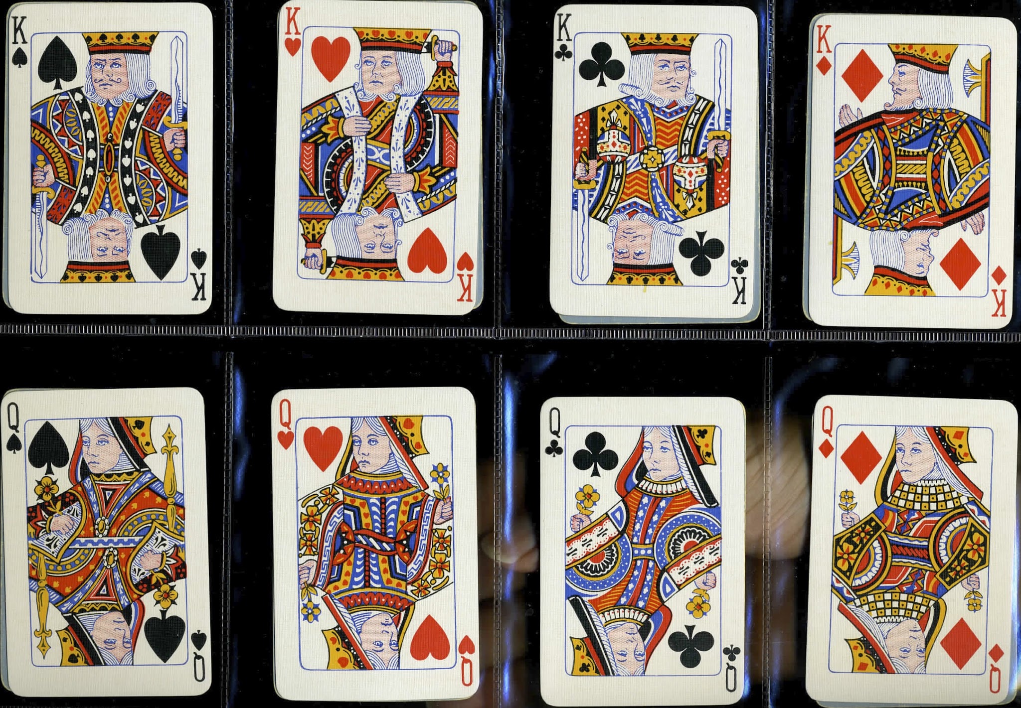
Above: Universal, c.1925
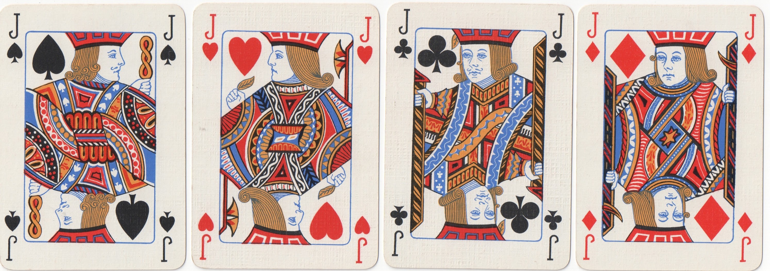
Above: Universal, c.1975, from a wide-size pack, probably old stock, published by Waddington as poker cards.
Universal's predecessor, British Playing Card Co., disregarded tradition even more. Some of their courts hardly count as standard English, if traditional features count for anything. The clothing is idiosyncratic and in the version illustrated below the courts of the same rank all face the same way. Note that the KD is not in profile and the QD holds a sceptre. All the pips are on the left.
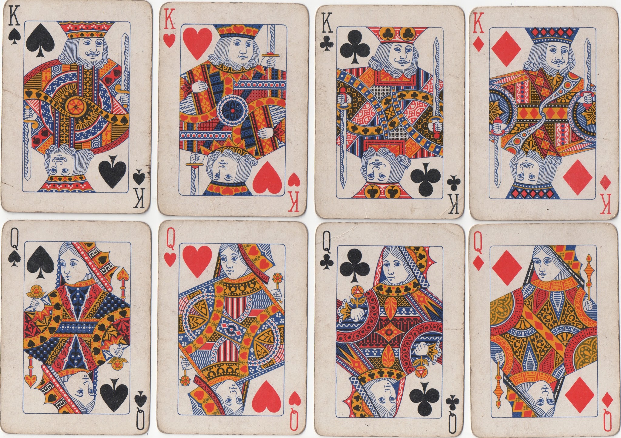
Above: British PC Ltd, c.1920
And one thing that's really exciting about collecting cards (or anything else probably) is that you never know when something new is going to pop up. Last year I bought a pack of modern USPCC Bicycle Bridge cards. I thought that the usual poker courts (US7) would have had their designs squashed or something of the sort, but when I opened the pack, I found a turned version of US5 with a redrawn QH. US5 has its origins in the American Bank Note Co's cards of c.1910. There are two non-traditional features: a QH with her pip on the right, so her posture has been altered to fit, including lowering her hand, and a left-facing JS. There were both bridge and wide-size versions.
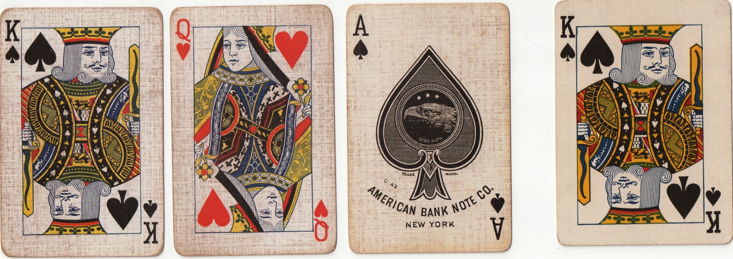
Above: American Bank Note Co., bridge - wide (right-hand card)
The USPCC acquired the design and used it in bridge packs such as Hamilton and Congress from some time in the 1950s to replace the older US3.1. They were still in use in packs such as Delesi for W H Smith in the 1980s and 1990s.
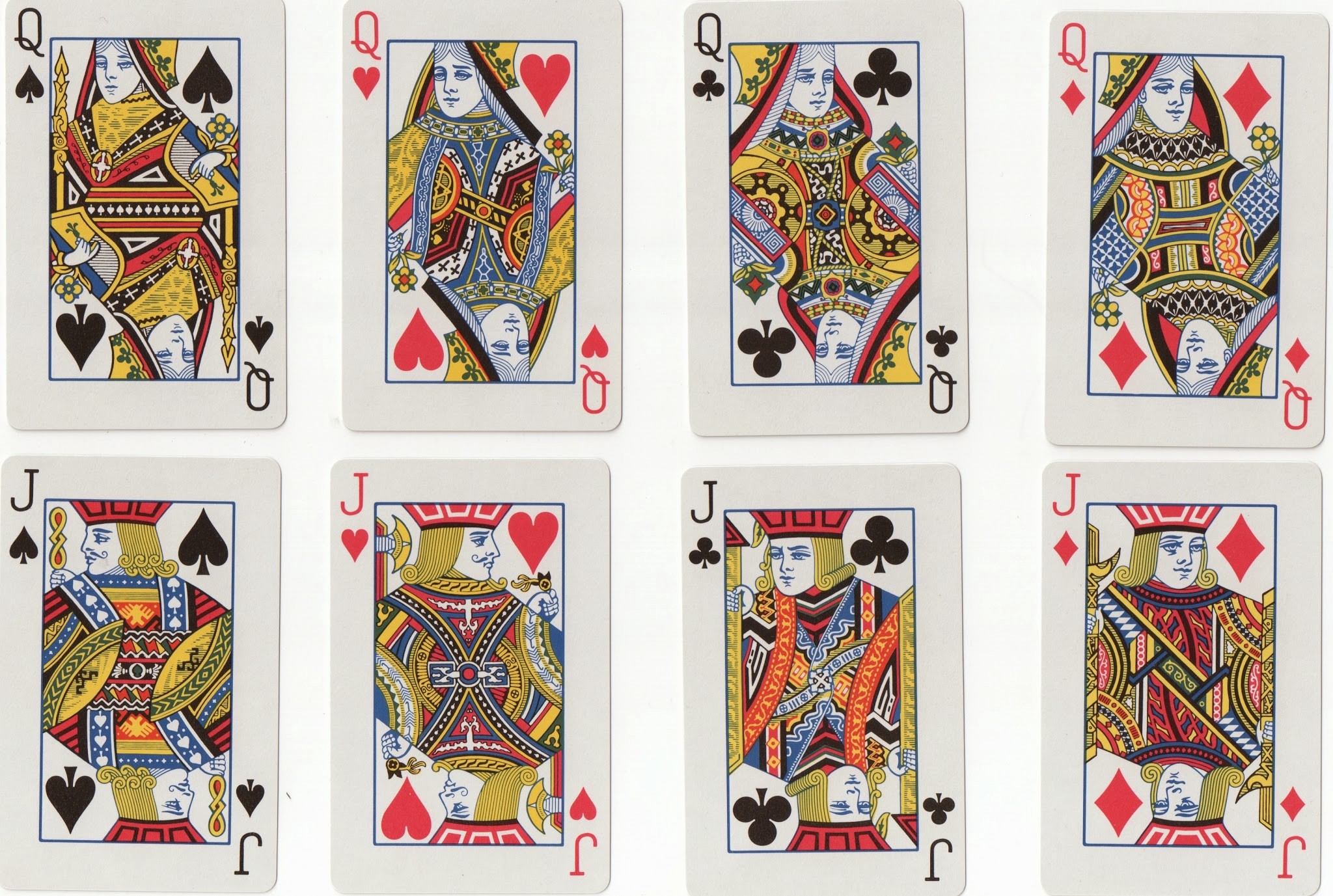
Above: USPCC, c.1965
When the designs were turned I have no idea; it may have been very recently. The courts all have left-hand pips now. This means that the kings are the same, but all the other courts are turned. Interestingly, rather than simply turning the QH, which would have given her a three-quarter right face, her head has been kept three-quarters left, but moved to the right to give room for the pip. Her body, on the other hand, has been turned, putting her hand on the left, giving a non-traditional look to her figure.
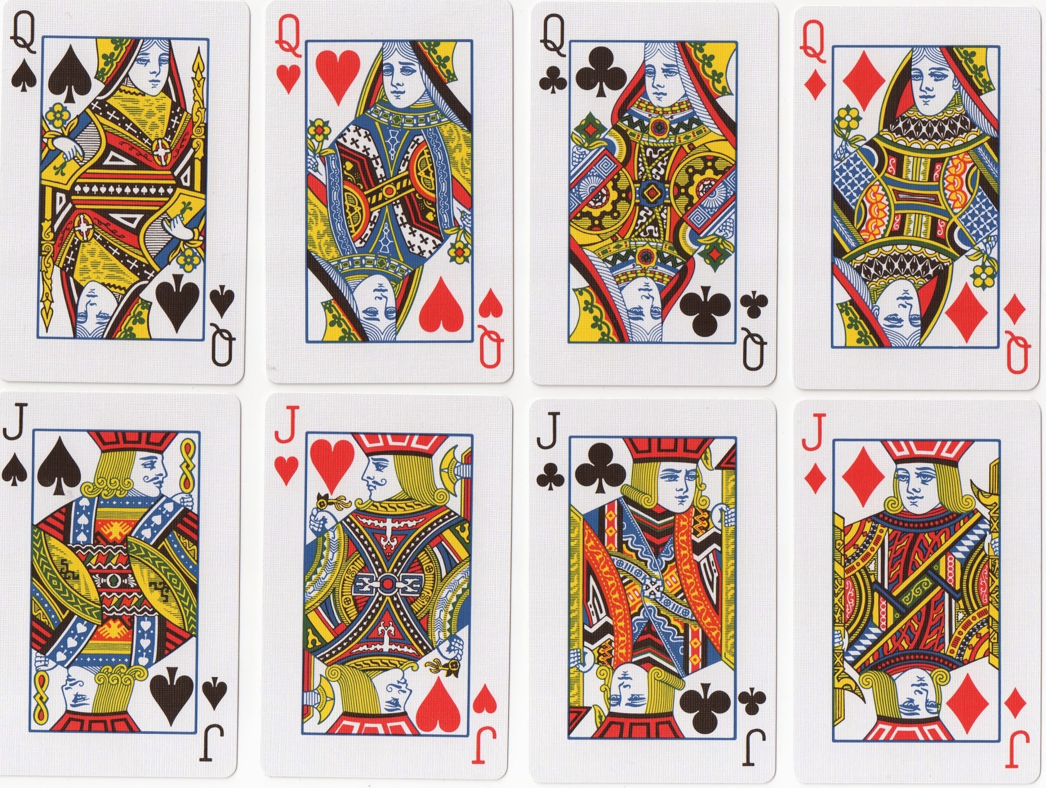
Above: USPCC Bicycle Bridge 86, 2013
ROUND CORNERS: these had no effect on the design of the cards; they were merely a method of helping the corners not to be bent too early in their use. They were introduced about the same time by most makers: Hunt's Playing Card Manufactory are advertising them in 1877, Willis and Woolley in 1878, and English introduced them around 1880.
CHANGE OF WIDTH: for the most part the change of width did not occur until after World War I. Newcomers to the scene, Waddington and British PC Ltd (later Universal), produced both widths, as did Goodall and De La Rue. Goodall seems to have introduced their narrower width in c.1910, and there are packs of similar width by De La Rue from about the same date. The narrowing of the card involved redesigning the court cards. The standardization of the narrower size in Britain occurred in the 1930s, probably with the rise in popularity of contract bridge. The wide-size cards disappeared during World War II, probably because of restrictions on the use of paper and card. The recent popularity of poker has seen a return of the wide-size pack to Britain (apart from a few sporadic attempts to re-introduce them in the 1960s & 70s) - usually made in China!! By the way, poker was not taken up in this country to any great extent until after World War I, contrary to some of the weird claims for poker hands on eBay!! True, Queen Victoria's court dabbled with the game in the 1870s, but I don't think these are the cards being offered on the Internet!

By Ken Lodge
Member since May 14, 2012
I'm Ken Lodge and have been collecting playing cards since I was about eighteen months old (1945). I am also a trained academic, so I can observe and analyze reasonably well. I've applied these analytical techniques over a long period of time to the study of playing cards and have managed to assemble a large amount of information about them, especially those of the standard English pattern. About Ken Lodge →
Related Articles

Batman® playing cards
Batman playing cards published by InterCol of London 1989.

Can You Believe Your Eyes?
“Can You Believe Your Eyes?” playing cards featuring visual illusions & other oddities.

Pastime Playing Cards for the Blind
The “Pastime” Playing Cards for the Blind manufactured by Goodall & Son Limd., c.1910.

French Revolutionary cards by Pinaut
Seven cards from a French Revolutionary pack by Pinaut featuring characters from classical antiquity...

Zürcher Festspiel 1903
Swiss-suited pack designed by Robert Hardmeyer featuring figures from art and politics.

Songs with Flute accompaniment
Eighteenth century English engraved cards with music for voice and flute.

Love Tests
Vintage novelty “Love Test” cards of a slightly saucy nature but all in good fun!

Never Mind the Belote
Limited edition Belote pack with designs by a collective of 24 street artists.

Ben 10 playing cards
Characters from the American animated television science fantasy series Ben 10.

Playing card designs by Franz Exler
Reconstruction of playing cards from the original 1903 designs.

MITSCHKAtzen
Clever cat designs by the Austrian artist and illustrator Willi Mitschka.

22 Pittori in 22 Arcani
Collaborative Tarot with contributions from 22 different Italian artists including Menegazzi and Tav...

Doctor Who Trump Card Game
Game for two players in which Doctor Who and the Legendary Legion join battle with the Alien Hordes....

Whist by Ditha Moser
Ditha Moser created this minimalist Whist deck in 1905, in the style of the Vienna Secession art mov...

Keith Haring playing cards
Energetic graffiti images by the American artist Keith Haring.

Disney’s Aladdin playing cards
Characters from the 1992 Disney film Aladdin.
Most Popular
Our top articles from the past 28 days

